 Codify
Appearance
Mappings
The Codify plugin can map Figma's style information to class names. This way, when generating code, corresponding atomic-level styles will be generated.
For example, popular CSS frameworks like Tailwind, as well as your custom class utility, can be used. We highly recommend using atomic-level classes to build the user interface in your projects.
Why is it recommended to use atomic-level CSS classes to build the user interface?
The usage of atomic-level CSS classes is often referred to as atomic design or functional CSS. The idea behind it is to break down style properties into the smallest units and create independent classes for each unit. These classes contain only a specific style property, such as color-red, font-size-large, or margin-top-20. It offers several advantages:
Flexibility:
Atomic-level CSS classes can be easily combined and reused, making the UI building process more flexible. By combining different classes, you can quickly create various style combinations without writing a lot of custom styles.
Maintainability:
Due to their single responsibility nature, atomic-level CSS classes are easier to understand and maintain. When you need to modify a style, you only need to make changes to the specific class, rather than modifying the entire style sheet.
Performance Optimization:
Atomic-level CSS classes often result in smaller style sheets, which helps reduce page load time. Additionally, by applying only the necessary style properties, unnecessary style calculations are minimized, resulting in improved rendering performance.
Consistency:
Atomic-level CSS classes follow consistent naming conventions, making it easier for developers to understand and predict style behavior. This helps maintain UI consistency, reduces style conflicts, and prevents unexpected behavior.
From ChatGPT
Currently, there is no better approach to generating semantic class names. Moreover, it is not desirable to have designers manually write class names for each element in every project. That's why most Design-to-Code tools choose to use atomic-level CSS classes to build interfaces. If new class names were generated every time, it would significantly impact code organization and project maintenance.
Therefore, in version 1.0.0, Codify refactored its style parsing engine. The plugin now checks whether the styles in the design file are mapped to pre-defined class names. We are also exploring additional ways to optimize style generation.
TIP
When reading this file, it is recommended that you open mappings.json and try it while reading.
Json format description
Based on the document below, you will quickly realize that it is actually a standard CSS property. We need to write a mapping program according to the format provided by Codify in order to parse the styles from design drafts and convert them into CSS properties. So, please open the mappings.json file while reading and try it out.
The key in the JSON above represents the properties output by Figma, while the value corresponds to the mapped class name. If the property from your design file is not found in the mapping table, it will be output as a style attribute, for example: style="width: 100px;".
Codify has already mapped the style properties provided by prototyping design tools like Figma to CSS properties, making them more readable. Therefore, you do not need to understand the Figma API. You just need to follow the format provided in this document to write your mappings. You can even directly paste them into the mappings.json and start using it.
Tips
The class names can be unified with a prefix through the renderer options in the style parsing engine. If a prefix is set in the style parsing engine, the current style mapping does not need to include the prefix. example:
json
// style-parsers
"justifyContent": {
  "nodeName": "",
  "filter": "",
  "classAttr": "class",
  "styleAttr": "style",
  "classPrefix": "justify-",
  "stylePrefix": "justify-content",
  "getCssVar": false,
  "mappings": {}
}

// mappings
"justify-content": {
  "flex-start": "start",
  "center": "center",
  "flex-end": "end",
  "space-between": "between"
}

// Render as:
 justify-start
The following example uses Tailwind as the basis for configuring style mappings. However, it does not mean that you are limited to using Tailwind utility classes. If you want to configure a Tailwind utility class, you can simply copy the code below and add it to the mappings.json file.
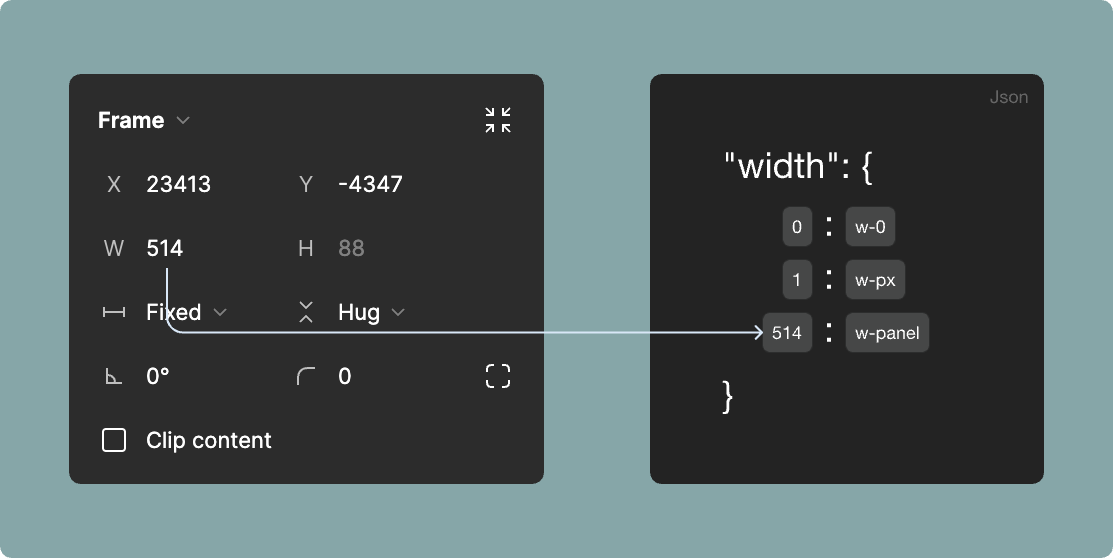
width
- key:
width value
json
"width": {
  "0": "0",
  "1": "px"
  //.....
}
min-width
- key:
min-width value
json
"min-width": {
  "0": "0",
  "1": "px"
  //.....
}
max-width
- key:
max-width value
json
"max-width": {
  "0": "0",
  "1": "px"
  //.....
}
height
- key:
height value
json
"height": {
  "0": "0",
  "1": "px"
  //.....
}
min-height
- key:
min-height value
json
"min-height": {
  "0": "0",
  "1": "px"
  //.....
}
max-height
- key:
max-height value
json
"max-height": {
  "0": "0",
  "1": "px"
  //.....
}
display
- key:
flex
Currently, only the conversion of Auto Layout from design drafts to Flex layout is supported.
json
"display": {
  "flex": "flex"
}
flex
- key:
none | auto | fill-x | fill-y | wrap
| Figma Attributes | Codify Attributes |
|---|---|
| Fixed width | none |
| Hub contents | auto |
| Horizontal Fill container | fill-x |
| Vertical Fill container | fill-y |
| Wrap | wrap |
json
"flex": {
  "none": "flex-none",
  "auto": "flex-auto",
  "fill-x": "flex-1",
  "fill-y": "self-stretch",
  "wrap": "flex-wrap"
}
justify-content
- key:
flex-start | center | flex-end | space-between
| Figma Attributes | Codify Attributes |
|---|---|
| Align top left | flex-start |
| Align top center | center |
| Align top right | flex-end |
| Auto | space-between |
json
"justify-content": {
  "flex-start": "start",
  "center": "center",
  "flex-end": "end",
  "space-between": "between"
}
align-items
- key:
flex-start | center | flex-end
| Figma Attributes | Codify Attributes |
|---|---|
| Align top left | flex-start |
| Align left | center |
| Align bottom left | flex-end |
json
"align-items": {
  "flex-start": "start",
  "center": "center",
  "flex-end": "end"
}
TIP
If your design draft uses the Align center attributes, the parsing tool will automatically add the mapped class names for justify-content and align-items. If value of center. it will generate class="justify-center items-center".
flex-direction
- key:
row | column
| Figma Attributes | Codify Attributes |
|---|---|
| Vertical layout | row |
| Horizontal layout | column |
json
"flex-direction": {
  "row": "row",
  "column": "col"
}
gap
The mapping of gap has two attributes: direction and size
- direction key:
gap | column-gap | row-gap - size key:
value
| Figma Attributes | Codify Attributes |
|---|---|
| gap | gap |
| Vertical gap | row-gap |
| Horizontal gap | column-gap |
json
"gap": {
  "0": "0",
  "1": "px",
  "2": "0.5",
  "4": "1",
  "6": "1.5",
  "8": "2",
  "10": "2.5",
  "12": "3",
  "14": "3.5",
  "16": "4",
  "20": "5",
  "24": "6",
  "28": "7",
  "32": "8",
  "36": "9",
  "40": "10",
  // ......
}
This will output style names like gap-0 gap-x-0 gap-y-0, and so on, based on the prefix set in the gap style parsing engine.
font-family
The display of font styles depends on whether the user's device has the corresponding fonts installed. If not, the browser will attempt to use fallback fonts or default fonts to display the text. Therefore, to ensure consistency and accuracy of font styles, it is recommended to set and import the corresponding fonts in advance in the CSS file when using specific font styles. Then, you can map them using the "mappings" option.
- key:
Font family name
You css file
scss
@font-face {
  font-family: "poppins";
  src: url("yourPath/poppins.ttc");
}
.font-poppins {
  font-family: "poppins";
}
mappings.json
json
"font-family": {
  "Poppins": "poppins"
},
If your text layer uses a font from the font mapping table, it will output a style like class="font-poppins".
TIP
The default system font-family do not need to be defined here. Additionally, you can also set filters for system default fonts in the font-family parsing This is because in most cases, we don't need to declare the font-family style for every text node.
color
Similar to CSS properties, the color property is used here solely as a text attribute. The color property is used to define text styles and maps to the text styles defined in your Figma design drafts. Here is an example:
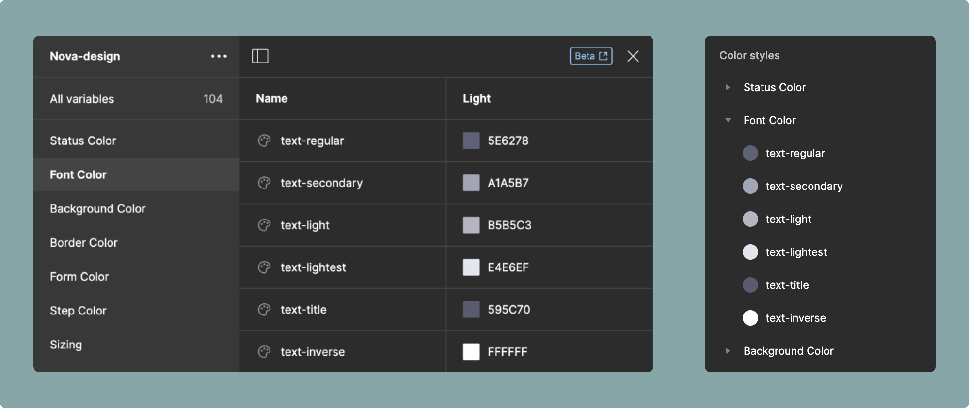
- key:
Variable nameorClass name
json
"color": {
  "text-regular": "regular",
  "text-secondary": "secondary",
  "text-light": "light",
  "text-lightest": "lightest",
  "text-title": "title",
  "text-link": "link",
  "text-hover": "hover",
  "text-active": "active",
  "text-inverse": "inverse"
}
The advantage of this approach is that even if the styles in the design drafts and the class names in frontend development are not consistent, they can still be associated and mapped. For example, designers often prefer naming styles in the following way:
json
"color": {
  "neutral-100": "regular",
  "neutral-200": "secondary",
  "neutral-300": "light",
  "neutral-400": "lightest"
}
While using such naming conventions in a color palette may be feasible, it does not align with the principles of semantic naming in frontend development. Therefore, you can choose to map them to corresponding semantic class names.
WARNING
So, in the configuration mentioned in this document, all color-related styles are not following the default naming format provided by Tailwind. Additionally, Tailwind has proposed naming modifications, and you can refer to the official Tailwind documentation.
heading
We recommend that you define the heading style in your design system. This ensures that the generated code is more compliant with W3C specifications.
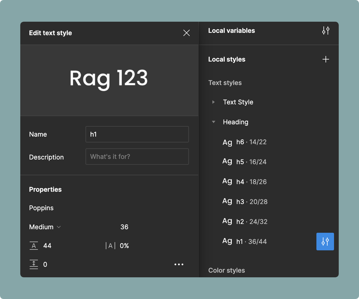
- key:
Variable nameorClass name
json
"heading": {
  "h1": "h1",
  "h2": "h2",
  "h3": "h3",
  "h4": "h4",
  "h5": "h5",
  "h6": "h6"
}
font-size
Map class names based on font size.
- key:
font size value
json
"font-size": {
  "12": "xs",
  "14": "sm",
  "16": "base",
  "18": "lg",
  "20": "xl",
  "24": "2xl",
  "30": "3xl",
  "36": "4xl",
  "48": "5xl",
  "60": "6xl",
  "72": "7xl",
  "96": "8xl",
  "128": "9xl",
}
font-weight
Map class names based on font weight.
- key:
font weight value
json
"font-weight": {
  "100": "thin",
  "200": "extralight",
  "300": "light",
  "400": "normal",
  "500": "medium",
  "600": "semibold",
  "700": "bold",
  "800": "extrabold",
  "900": "black"
}
text-align
Map class names based on font text align.
- key:
left | center | right | justify
| Figma Attributes | Codify Attributes |
|---|---|
| Text align left | left |
| Text align center | center |
| Text align right | right |
| Text align justified | justify |
json
"text-align": {
  "left": "left",
  "center": "center",
  "right": "right",
  "justify": "justify"
}
letter-spacing
The letter-spacing property can be mapped to the letter spacing style in the design draft. It is important to note that Figma's letter spacing style can accept values in px or %. Therefore, when writing the mapping configuration, make sure to include the corresponding unit.
- key:
letter spacing value
json
"letter-spacing": {
  "0": "normal",
  "-5%": "tighter",
  "-2.5%": "tight",
  "2.5%": "wide",
  "5%": "wider",
  "10%": "widest"
}
line-height
The line-height property, similar to the letter-spacing property, can be mapped in the same way. In Figma, it can accept values in px or %. Therefore, when writing the mapping configuration, make sure to include the corresponding unit.
- key:
line height value
json
"line-height": {
  "12px": "3",
  "16px": "4",
  "20px": "5",
  "24px": "6",
  "28px": "7",
  "32px": "8",
  "36px": "9",
  "40px": "10",
  "100%": "none",
  "125%": "tight",
  "137.5%": "snug",
  "150%": "normal",
  "162.5%": "relaxed",
  "200%": "loose"
},
padding
The padding corresponds to the padding style in Figma. you can set the prefix for the padding style parsers.
- direction key:
p | pt | pl | pr | pb | px | py - size key:
padding value
json
"padding": {
  "0": "0",
  "2": "0.5",
  "4": "1",
  "6": "1.5",
  "8": "2",
  "10": "2.5",
  "12": "3",
  "14": "3.5",
  "16": "4",
  // ......
}
If you set the padding top of a layer node to 16px, it will output pt-4. Similarly, if you set the padding bottom of a layer node to 16px, it will output py-4.
background
The background property corresponds to the Fill style in Figma. Similar to the color property, it is used to map the custom fill styles defined in your Figma design drafts.
- key:
Variable nameorClass name
json
"background": {
  "bg-body": "body",
  "bg-content": "content",
  "bg-light": "light",
  "bg-popup": "popup",
  "bg-element": "element",
  "bg-hover": "hover",
  "bg-active": "active",
  "bg-header": "header",
  "bg-transparent": "transparent"
}
We are well aware that text styles are defined using the color:, while background colors are defined using the background-color:. These two properties are not interchangeable. If you fill a text style in Figma for a Frame or Shape node, it will output background-color: var(--text-primary). Therefore, you should prepare Css Variable in advance for your frontend project. The Codify plugin can exporting Figma styles as Css Variable with a single click.
border-color
- key:
Class name
json
"border": {
  "border-regular": "regular",
  "border-light": "light",
  "border-dark": "dark",
  "border-deepdark": "deepdark",
  "border-transparent": "transparent"
}
border-width
- key:
border width value
json
"border-width": {
  "0": "0",
  "1": "1",
  "2": "2",
  "4": "4",
  "8": "8"
}
border-style
- key:
solid | dashed | dotted
json
"border-style": {
  "solid": "border-solid",
  "dashed": "border-dashed",
  "dotted": "border-dotted"
}
If you want to output a style with only a 4px dashed border on the top, it would be class="border-t-4 border-dashed border-regular".
The border color, similar to the background color, needs to be prepared in advance in the Figma styles. If there is no mapped corresponding style, will be output css style, as mentioned in the Json format description section.
radius
The radius property corresponds to the Corner radius style in Figma.
- key:
Corner radius value
json
"radius": {
  "0": "none",
  "2": "sm",
  "4": "default", // If it is the default value, please set it as "default".
  "6": "md",
  "8": "lg",
  "12": "xl",
  "16": "2xl",
  "24": "3xl",
  "9999": "full"
}
As indicated in the highlighted section above, if you wish to output a style like Tailwind rounded instead of rounded-default, you can map it to default. if a 4px border is selected in the design draft, it will directly output rounded.
opacity
The opacity property corresponds to the Opacity style in Figma layers. It represents the transparency of the layer, rather than the opacity of the color.
- key:
opacity value
json
"opacity": {
  "0": "0",
  "0.05": "5",
  "0.1": "10",
  "0.15": "15",
  "0.2": "20",
  "0.25": "25",
  "0.3": "30",
  "0.35": "35",
  "0.4": "40",
  "0.45": "45",
  "0.5": "50",
  "0.55": "55",
  "0.6": "60",
  "0.65": "65",
  "0.7": "70",
  "0.75": "75",
  "0.8": "80",
  "0.85": "85",
  "0.9": "90",
  "0.95": "95",
  "1": "100"
},
box-shadow
The box-shadow property, similar to the color property, is used to map the shadow styles defined in your Figma design drafts.
json
"box-shadow": {
  "shadow-none": "none",
  "shadow-sm": "sm",
  "shadow": "default",
  "shadow-md": "md",
  "shadow-lg": "lg",
  "shadow-xl": "xl",
  "shadow-2xl": "2xl"
}
position
The position property can map the Constraints style in Figma.
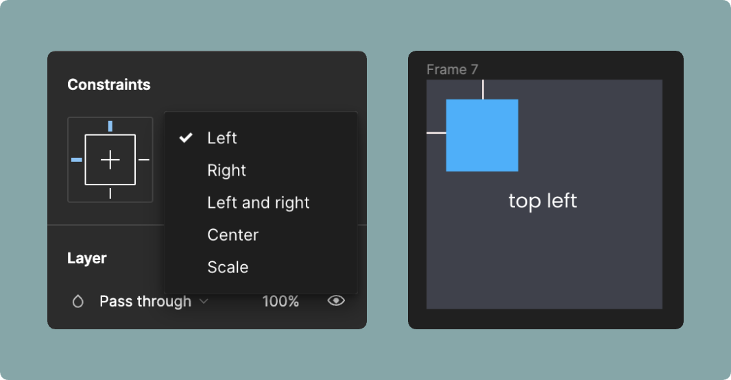
json
"position": {
  "fixed": "fixed",
  "relative": "relative",
  "absolute": "absolute",
  "sticky": "sticky"
}
The position property can also determine the values of top, right, bottom, and left based on the selection made in your design draft. Please refer to the Style parsers section for more information.
overflow
The overflow property is used to map the Clip content attribute in Figma. When your container is set to clip the overflowing content, the corresponding class name hidden will be added.
json
"overflow": {
  "hidden": "overflow-hidden"
}